
Here are three ways marketers are using Dynamic Media to optimize visual assets and make lasting impressions on their clients.
Powerful visual experiences are what give any website its wow factor. On average, images lead to 94% more viewership on web pages than text. But perhaps more importantly, they capture your clients’ attention and amplify your brand’s message.
Making sure visual assets look beautiful on any screen is not as simple as hitting publish. With so many ways to consume content, marketers working through Adobe’s AEM need to be able to:
- Size their images for different screens
- Get their assets Retina-ready
Integrate progressive images for faster loading times
Thankfully, there’s Dynamic Media, a powerful yet little-known solution built right into AEM that can help marketers easily achieve all three of these tasks. Before we explain how Dynamic Media works, let’s go through some of the use cases we just mentioned.

Image sizing for different screens
A picture may be worth a thousand words, but if that picture takes too long to load, it quickly loses its impact. File size is one of the biggest obstacles to seamlessly delivering eye-catching visual assets. To reduce loading times, marketers need to provide different renditions of an asset for various devices and resolutions.
The size of an image directly influences its file size, and the bigger the file size, the longer the download time. This is particularly important when working with header and banner images, which make the first big impression on viewers.
But with so many different specifications out there for different devices, scaling an image for every platform can leave marketers tearing their hair out.

Getting your assets Retina-ready
Imagine web page that’s ready to go live. The site’s image assets look beautiful on desktop, but when they open the page on their iPhone, the images suddenly look blurry.
The advent of Apple’s Retina technology creates a blessing and a burden for marketers and developers. While Retina display gives visual assets a crisper, cleaner look, it also means the assets require optimization, so they can look great on any kind of display. To do this, marketers have to provide renditions of an asset for Retina screens, and others for non-Retina screens.
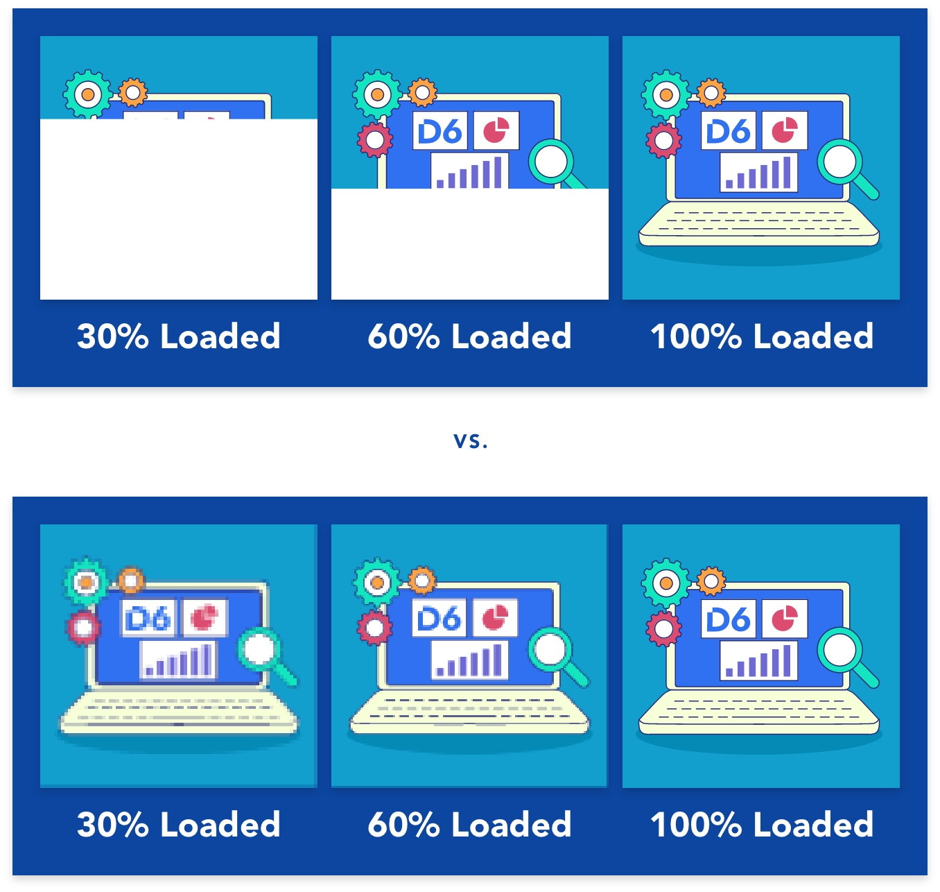
Integrate progressive images for faster loading times
When a client clicks on a webpage, the page’s images tend to load top-down. After the image has finished downloading, the website needs to re-calculate the layout. Even though the image has already been downloaded and the client sees a website, this layout calculation slows down rendering, which pushes your content down Google’s priority list.
Progressive images load differently, increasing their resolution as the website loads. They are smaller in file size than baseline JPEGs, which means your website has less data to load. In short, progressive images lead to a more seamless viewing experience, and a boosted search engine ranking.
Enter: Dynamic Media
If marketers want to deploy captivating visual experiences on their website, they need to ensure those experiences are optimized for any channel or device. Adobe Dynamic Media can help marketers optimize content with the push of a button.
Here’s how it works: starting from a master file, Dynamic Media automatically creates different sizes, file formats, resolutions, and crops for any media, in real time. Marketers can request variations to this content through an asset URL, and Dynamic Media creates them without having to make redundant file copies.
Dynamic Media merges the workflows of the AEM digital asset management solution to turn hours of editing labour into a streamlined, automated process.
By using Dynamic Media in AEM, your marketing team can spend less time and effort creating and deploying media assets, while maximizing the value of your assets and creating enduring client experiences.