Here’s a riddle for you: What do ‘digging into a fresh bag of chips only to pick up a stale one’ and the product browsing experience on GameStop.ca have in common? Answer: They’re both unexpectedly unpleasant experiences!
Allow me to explain – while you and I might dig our digits into a bowl of chips expecting salty goodness, we quickly become disappointed when said chip is of the soggy or stale variety. In much the same way, shoppers seeking a more visual product browsing experience on GameStop.ca may find themselves disappointed.
The truth is, when we go to a trusted source and end up frustrated too many times, we naturally begin to lose that hard-earned trust. Most importantly, we may begin looking elsewhere. Let’s examine how this relates not just to GameStop, but to your company’s website as well.
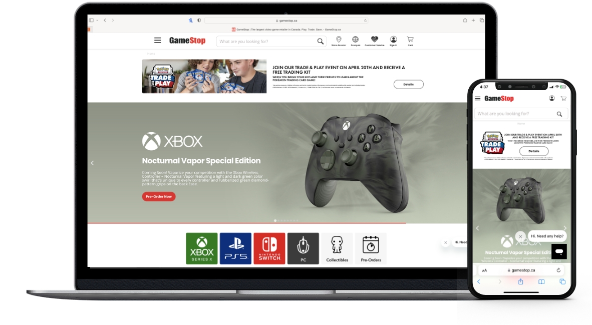
Image source: www.gamestop.ca
When browsing on most e-commerce websites, there are generally a few common elements to the customer experience:
- Featured promotions
- Categorization
- Dedicated product details pages
- Cart functionality (among others)
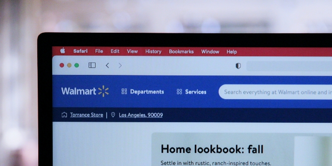
Whether it’s Amazon, eBay, Walmart, or even your local retailer with an online shop, the ability to provide an intuitive and mobile-friendly experience is critical to success. This includes having a top-tier product details page. It’s that product’s chance to shine in the spotlight after all!
Unfortunately for the world’s largest video game retailer in GameStop, attempting to navigate the image gallery functionality on their product details pages is neither particularly intuitive nor easy to use. Using the example of the “Super Mario: Mushroom Light” item at you’ll notice that when trying to use the on-page image gallery functionality – also known as a “carousel” – that the next and previous arrows don’t allow visitors to navigate all of the available product images unless they click one of the small thumbnail images to trigger a pop-up carousel which then allows them to loop through all available product images.
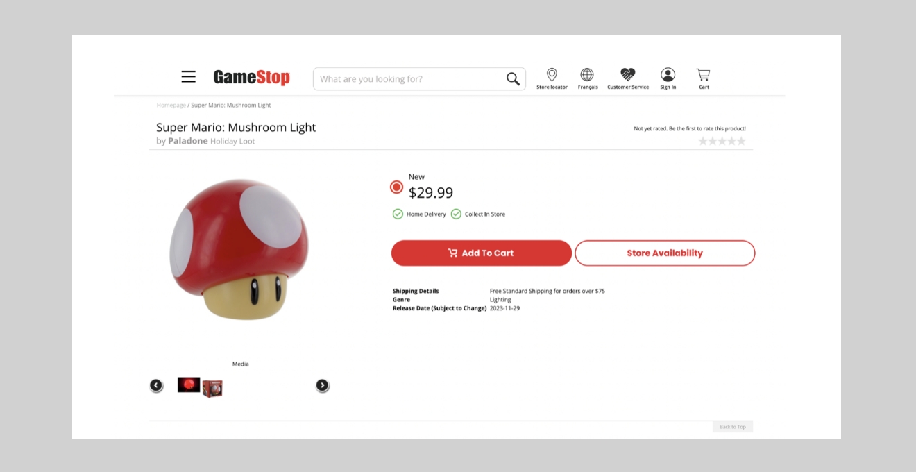
Image source: www.gamestop.ca
Want to see the full collection of available product images? Rather than using the next and previous arrows to change the main image displayed, you’ll have to click one of the small thumbnails to trigger a pop-up version of the image.
While this approach does provide visitors an alternative way to browse through all available product images compared to what they might initially expect through the next and previous arrows, the ease of use and mobile-friendliness of the pop-up carousel are less than ideal.
GameStop has done well with implementing accessibility alt text (check out this link from our blog to find out more about accessibility alt text) and keyboard navigability, but carousels are often advised against as a web content strategy, due partly to the following factors:
- Poor engagement
- Poor mobile responsiveness
Difficult to control or navigate through - especially if it automatically advances (autoplays)
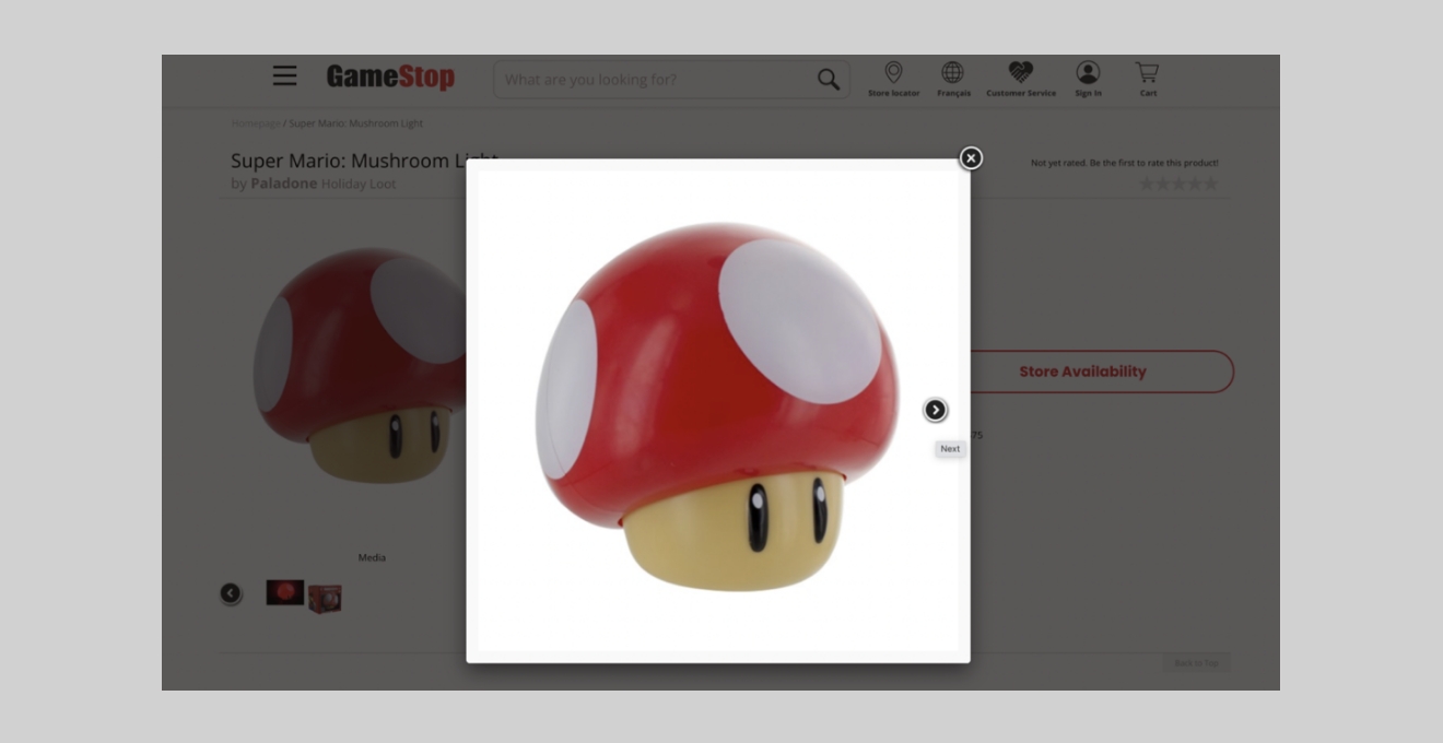
Image source: www.gamestop.ca
Sticking with our previous product example, you may also notice that on larger screens the next and previous arrows move with each slide as the layout shifts. Even though the last list item above specifically references ‘autoplay’ functionality, this is another instance of the less-than-ideal navigability. Visitors would expect visual interactive controls to remain in a consistent location on the page.
The mobile responsiveness of their product details carousels also leaves a bit to be desired, as swipe functionality is not available. This tends to leave customers seeking to browse on mobile in a situation where tapping only a very specific location of the screen will function as expected instead of a much simpler swipe gesture on a larger touch zone for improved usability.
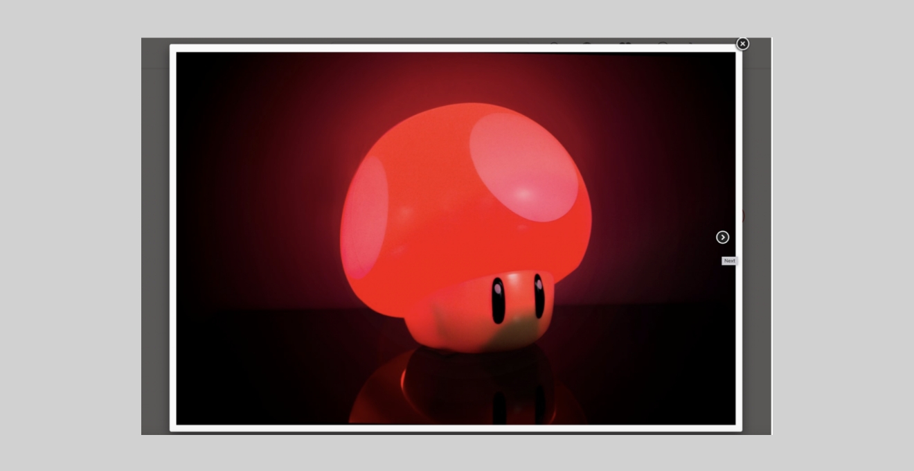
Image source: www.gamestop.ca
Moral of the story: Don’t be one of the bad players in the web ecosystem by providing a sub-par user experience. Also, be sure to keep a user-centric, contextually aware approach in mind when considering your web content strategy. Your audience is your greatest asset!
To learn more about common UX pitfalls and to read other website nightmare horror stories, click here