Sports media is one of the few sectors of journalism that isn’t floundering in the digital economy. In fact, the market is more cutthroat than ever, with powerful heavyweights and disruptive newcomers all vying for a slice of fans’ attention and engagement.
With the sports media sector more competitive than ever, having a well-designed and functional website across all devices can help outlets attract and retain readers, improve engagement and credibility, and make their brand stand out from the rest. Let’s explore how one erroneous design choice impacted the usability of one sports media site.

Image source: www.sportsnet.ca
Sportsnet bets on digital
In the Canadian sports media arena, two players dominate: The Sports Network (TSN) and Sportsnet. TSN, owned by Bell Media, is not only the first sports network in Canada, but has generally led in viewership and web presence. Second to TSN is Sportsnet, acquired by Rogers Media in 2001.
Bell and Rogers have aggressively expanded their telecommunications empires across television, radio, and web media for the last 15 years. But the competition really heated up in the last few years, when the rivals put a new premium on sports properties.
In 2013, Rogers upped the ante with a new, re-designed website for Sportsnet. Rogers claimed it was the first and – at the time – only sports website in Canada using responsive design. The company boasted the site’s “unparalleled functionality” and “best-in-class navigation.”
Rogers’ guiding philosophy was to create a sports news website that truly understood its audience, whether it was through an up-to-date scoreboard or a responsive design and layout with a strong visual hierarchy. But for all of its bells and whistles, many visitors found Sportsnet’s new website disorienting and frustrating to use on mobile browsers, and this was because of how the website forced users to consume content.
Sports is one of the few growing segments in journalism. Many sports companies in web, print, and broadcast have grown their online digital presence to satiate this growing appetite for sports information consumption. In instances where the same information and highlights are being covered, how does one website standout from another? One key differentiator and major competitive advantage is having a modern website built with rich features.
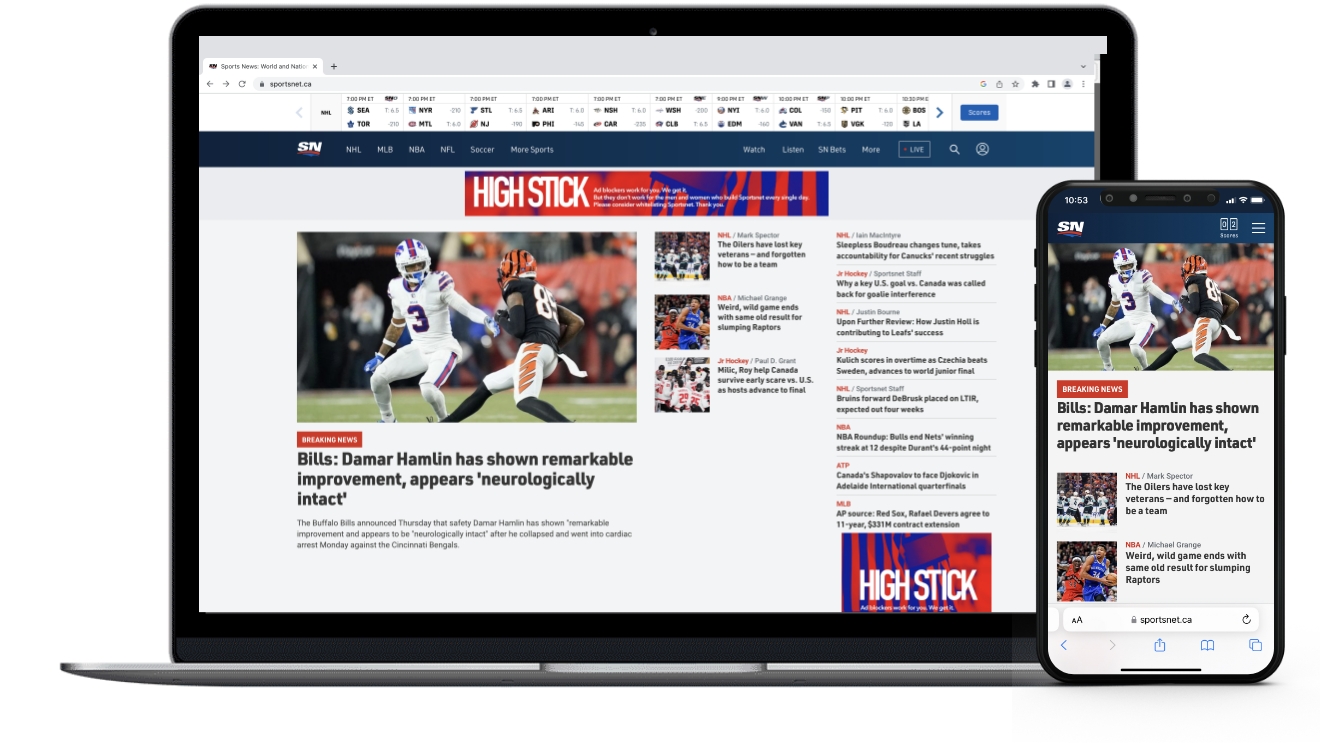
Image source: www.sportsnet.ca
To scroll, or not to scroll
Modern websites fall under can use several categories of content organization, including paginated sites, which divide content into separate pages, and infinite scroll, which allows users to scroll through a mass of continuously loading content. Both are user interface designs through which web content can be displayed, processed, and indexed.
Rogers decided to employ infinite scroll for the Sportsnet website, and while it’s not uncommon for news organizations to use infinite scroll, there were several reasons this decision made the website virtually unusable:
1. A bottomless pit of content
With pages that scroll infinitely, an “About” or “Content” link typically found in footers become buried under a never-ending stream of content. While this format can be good for bite-sized content, it’s not ideal for users who want to jump in an out of stories.
2. The scroll bar is irrelevant
The scroll bar serves an important function for website visitors. Namely, it allows them to determine how much content is remaining, which can be particularly important for visitors reading longer pieces of writing. With articles dynamically loading, scroll bars are almost always displaying an incorrect page length.
3. Accessibility issues
Infinite scroll can make it challenging to access and bookmark information on footers, sidebars, or other relevant pages of a website. This technique can also run the risk of deterring users that use assistive technology to help them access pages or web elements.
4. Load speed and memory footprint
Since a large chunk of content is housed on a single page that grows as users scroll, infinite scroll can seriously drag down page load times. This is particularly true on mobile devices, since mobile browsers don’t get a chance to “breathe” before being forced to chock up more content.

Image source: www.sportsnet.ca
Bottom line: The way you organize content matters
Infinite scrolling is great for users who are looking to browse with minimal clicks, but in many cases, users want to be able to jump around between stories or save one for future reading. Stacking articles on an endlessly scrolling page can cause users to lose their place, grow frustrated, or abandon the website altogether.
Whether you’re leaning toward infinite scroll or pagination for your next digital project, testing and record-keeping are paramount to ensuring new features don’t kill old functionality. At the end of the day, your goal should be to arrange and display your content in a way that satisfies your users’ needs. When done right, your website’s visitors won’t have to work to find what they’re looking for — the content will already be at their fingertips.