There’s a hot debate today over responsive vs mobile web design. In this post, we’ll go through the pros and cons of each to see which is best for your website.
Our internet habits have changed considerably over the last decade. Nowadays, over 90% of internet users get online through a mobile device, and more than half of internet users purchase online products on their mobile phones.
The reign of desktop is over, and the mobile market is growing at an astounding rate. With this in mind, companies must offer a user-friendly web experience that works across a variety of devices. There are several approaches developers and marketers can take when designing a website, with the most common being:
- Mobile-dedicated design
- Responsive design
- Mobile-first design
You’ve likely heard about these terms, but it can be hard to grasp where they differ. Here, we’ll go through mobile design, responsive design, and mobile-first design, and explain which comes out on top.
What is a mobile-dedicated website?
A mobile website is typically completely distinct from a desktop website. These sites are housed under a distinct URL, and visitors will be redirected to that separate mobile page when using a mobile internet browser.
Big Tech firms like YouTube, Facebook, Amazon etc. host mobile sites to create a more user-friendly experience on phones and tablets. These sites tend to look similar to the companies’ existing mobile apps, where content is cherry-picked from the larger, desktop version to fit neatly into a smaller screen.

What is responsive website?
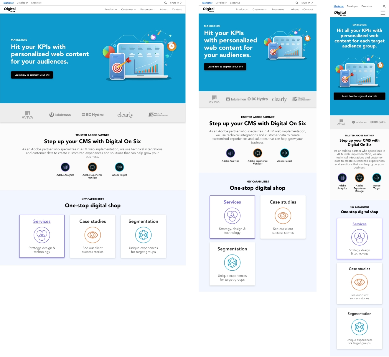
A responsive website typically starts with a design on desktop that automatically adapts content for different-sized screens, including mobile. Responsive webpages will detect a visitor’s screen size and orientation, and adjust the page’s content (such as images, text, and navigation) accordingly.
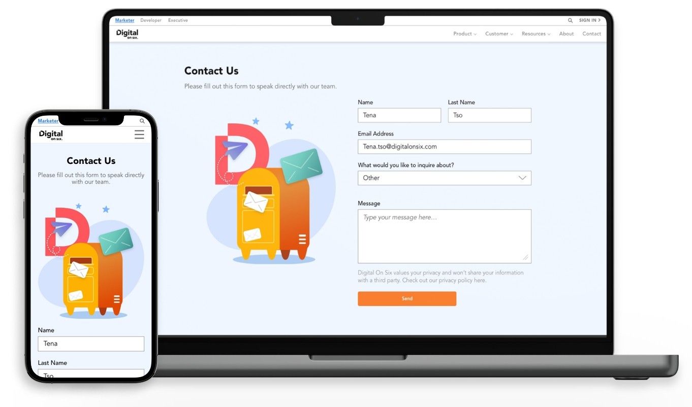
In the example below, you can see a website from a desktop device with a horizontal navigation bar. On a mobile device, the contents of that menu are hidden, and it instead appears as a dropdown list.

The pros and cons
Mobile-dedicated websites have content specifically tailored for smaller screens, so they tend to load content faster and lend to a more streamlined appearance. On the flipside, mobile-only websites also require more maintenance, because they are potentially disconnected from their desktop counterparts.
Responsive design removes the requisite for a separate mobile website since they scale content automatically. While this might seem like a boon for developers, it can make websites slower to load.
SEO also plays an important role in this contest. In 2019, Google began mobile-first indexing by default, meaning the search giant’s algorithms use content from mobile versions of websites to index and rank search results. So, if you aren’t prioritizing your website’s mobile experience, you can wave potential new visitors goodbye.
Mobile-first design: the best of both worlds
As the great debate over responsive versus mobile-dedicated rages on, there’s a third option emerging in this arena that combines the best qualities of both design approaches: mobile-first.
When building mobile-first websites, developers start by creating web pages for the smallest screen size, and gradually scale up the design for larger screens.
As developers gain more screen real estate on larger devices, they can expand the functionality with more elements and features. A mobile-first approach leads to a website that better prioritizes content, which can vastly improve UX.
A mobile-first website is still a responsive website, but since mobile screens have the most limitations (including screen size and bandwidth), designing within tighter parameters allows developers to better prioritize content, improve loading times and SEO, and make their website appeal to the mobile population of internet users.
Like it or not, we’re now living in a mobile-first world, and this has big implications for web developers and marketers. Designing for smaller screens from the outset enables your team to focus on the core functions of your website, so your audience gets the best experience on any device.
Looking to get started with your mobile-first website?
Contact Digital On Six for your next project today.


