In our previous article, we highlighted some areas of improvement amongst the pagination & information architecture on leons.ca. In this second and final post for this case study we’ll be looking at why mobile visitors are just as important as desktop ones, why quality of data is critical for success and finally some key takeaways for ensuring your website offers a top notch experience for everyone.
Maintaining site consistency from desktop to mobile
In today’s world where around 60% of online traffic comes from our phones (data referenced from Statista - https://www.statista.com/statistics/277125/share-of-website-traffic-coming-from-mobile-devices), making sure a company’s website works just as well on a smartphone as it does on a laptop is critical for online sales. But Leon’s seems to be designing for a computer first, and not all features are being translated to mobile.
Take the example of finding a new refrigerator - on a laptop screen the ability to shop by type, width, colour, or brand is a solid start. On mobile however (screenshots below), this functionality is nowhere to be found.
Retaining all core functionality regardless of screen size is one of the key principles of responsive web design. For Leon’s, removing product filtering options on mobile makes it harder for customers to make a purchase decision, potentially leading to lost sales.
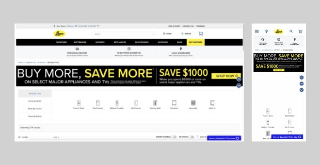
Image source: www.leons.ca
Geolocation is only useful when it works
On the face of it, detecting where a customer is browsing your site from and letting them know a nearby location may have what they’re looking for in stock is a great sales opportunity. Doing this seems relatively straightforward given what’s possible with modern technical capabilities.
But having high-quality data is paramount to the success of any geolocation feature. Without it, a customer can get excited that an item is in stock nearby only to discover that the store the website thinks is closest is actually several kilometres away. Although the customer might still complete their purchase, the experience is frustrating and could leave them with an unfavourable impression of the website (and company).
Despite their best intentions, the postal code in the geolocation feature did not display the correct value nor the closest store to my location at the time of browsing.
When trying to locate an item near me on leons.ca having provided my postal code, the website suggested the closest location was eight kilometres away. In reality, my closest Leon’s was only three kilometres away. It is also worth noting that I was never prompted to allow the website to find my location to enhance the geolocation feature’s accuracy.
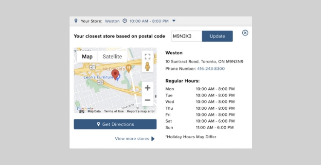
Image source: www.leons.ca
3 tips for better information architecture on your website
So, we’ve seen the impact of issues around pagination, feature consistency, and geolocation on leons.ca—but how do we solve them? Here are some quick takeaways we hope you’ll find useful for keeping your website top notch:
1. Communication is key
Always clearly communicate what is being presented to your customers and explain any changes that happen as they move through your site. Communication is especially important if changes aren’t explicitly confirmed or requested through a user action, like a click. Although we implicitly expect some things when browsing the web, if these expectations aren’t met the effect can be as significant as a lost customer.
2. Consistency, consistency, consistency
Regardless of the industry or how established a business is, consistency is invaluable for maintaining a solid foundation of customer trust. Having critical features work as expected regardless of location or device is fundamental to building trust and ensuring your business meets customer needs at every possible opportunity.
3. Put yourself in the customer’s shoes
Thinking about how, when, and where your customers are visiting your site is more important than ever. With all the automated intelligence and advanced marketing tools available today, helping your customers in the way it is most convenient for them should always be your top priority when designing your website.
Want to take your website to the next level? Contact us to find out how our D6 Engine can provide automation, segmentation, and ongoing support to augment the Adobe Experience Manager (AEM) marketing platform.