Putting the cart before the horse is likely an expression you’ve heard before - it is used to describe doing something in the wrong order. In the context of web design and information architecture, the order of information is particularly important as it can mean the difference between a completed sale or an abandoned cart if a customer is unable to complete their purchase due to a frustrating and/or non-functional website experience.
Based on a recent visit to their site, Canadian furniture retailer Leon’s might benefit from revisiting their own information architecture. In this blog, we look into some areas where this age-old phrase proves true and reminds us that ensuring the basics are addressed is essential before building any advanced features for a website.
Understanding a Canadian retail giant
Before we begin our journey forward, it is important to know our past—and in this case that means some background on the Leon’s brand. Leon’s is one of Canada’s oldest and most respected retailers for home furnishings, major appliances, and home electronics. Founded in 1909, the company now owns multiple banners and is still proudly run by the Leon family. But safeguarding the future of this established brand means making sure leons.ca offers customers a seamless and enjoyable shopping experience.

Image source: www.leons.ca
When pagination best practices are missing
Pagination might not be a term you’re very familiar with, but it is almost certainly a feature you’ve seen. While recently browsing for some home furniture, I experienced a less than ideal version of it which we’ll detail next. One of the most important features of well-crafted pagination is text that is consistent with the displayed results. Using my recent leons.ca visit as a reference, we find this element is missing as when I searched for dining tables the displayed count of matching results wasn’t accurate.
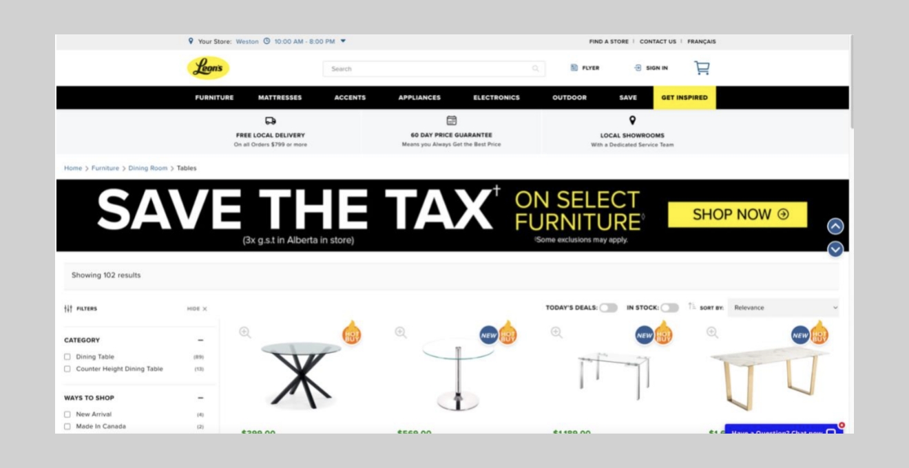
Image source: www.leons.ca
In the screenshot above, the grey bar below the promotional banner states that 102 results are shown; however only 60 items are displayed at a time before a “show more results” button becomes available. In this case, a basic but significant aspect of the pagination is missing—the ability for visitors to control how many items are displayed per “page”—despite the presence of more advanced filtering and sorting options.
Pagination vs. infinite scrolling and the user experience
Unfortunately, inconsistent text isn’t the only issue with the pagination on leons.ca. Another seemingly small but significant aspect of pagination is how changes to a user’s progress through search results is reflected in the URL.
In one particularly well-known approach, Google’s pagination involves allowing users to navigate between pages at their own pace through playfully but accurately adjusting the number of times the letter “o” appears in their name within their pagination. In this approach, the URL updates accordingly to show that the user is looking at a subset of all available results while displaying exactly how far along they are by highlighting the currently active “page.”
On the Leon’s website, the pagination appears to use what is commonly referred to as “infinite scrolling.” Also known as “lazy loading,” it involves loading new content as the user scrolls down without clear page separation. As the user scrolls down, leons.ca updates the page URL even though there is no explicit user action to display further content. This can be confusing and frustrating especially if trying to navigate to a previously viewed product when subsequent results have already been loaded.
Although the decision to combine infinite scrolling with automatically updating URLs was likely rooted in trying to reduce explicit user actions and extra clicks, two important aspects of the user experience have been overlooked: the abilities for customers to control how search results are explored, and the effective communication of search results.
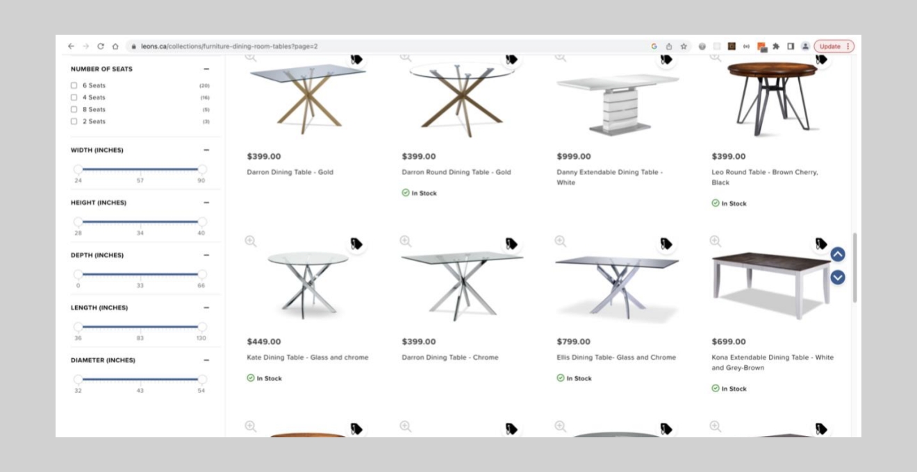
Image source: www.leons.ca
The URL indicates we are already on page 2 of the results, but we have only scrolled about halfway down the page and haven’t yet been presented/prompted to click to another page of results.
This package contains multiple parts
We’ve now seen why information architecture and consistency in communication are important aspects in ensuring clear expectations for any website experience, but come back soon for the second and final post of this case study where we’ll look into why responsive web design and data quality are critical to ensuring the success of your online business along with some quick tips to consider in your own projects!
Thanks for reading! Check out more of our Website Nightmares here!